Monday, December 29, 2014

Scorched Earth

Scorched Earth
Image Size 24" x 12"
Encaustic

We have been having a severe drought here in Southern California for several years.  Last year, I think we had three days of rain and none of those storms produced any significant rainfall.  Our rainy season is usually from November through April and so far we've had a couple of storms and one of them was huge so we're heading in the right direction.  Experts say even if we get our normal amount of rain this year (about 13") it will take several years for our ground water to be replenished.

We are supposed to get a storm either tomorrow or Wednesday so this painting is my artistic rain dance.  So many times rain is promised by our local weather people and none materializes.  I hope we get a nice storm that gives us a good amount of water but no downpours that will cause flooding.  Do you think it will work?  I'm sure it will.

This is another encaustic painting.  Molten wax seems like the perfect medium for a painting named "Scorched Earth".  I also added shellac to the painting and set it on fire.  That created a little too much texture in the sky so I added layers to tone it down.  I'm really happy with the result.

Monday, December 22, 2014

Pique

Pique
Image Size 36" x 54"
Acrylic

This is what the inside of my head looks like right now.....

I built a cradled surface using a 1/4" plywood with a veneer on one side and gessoed it several times to seal it and make a textured surface.  Then I did a combination of pouring and scumbling to create the image.  It was a very freeing project that let me get rid of a lot of frustrations.  Abstracts are great for that and there's nothing quite as liberating as throwing paint.

Monday, December 15, 2014

The Sentinel

The Sentinel
Image size 4" x 6"
Encaustic

December is always a busy month and this week was especially crazy so I didn't have much time for art.  This is a very small encaustic study that I did.  I enjoyed playing with layers of opaque and translucent wax.  The tree looks darker in this photo than it really is in person.

I'm planning to be working on encaustics this week too but first, I want to paint a large acrylic abstract.  I'll start that tomorrow...

Monday, December 8, 2014

Lake Powell Encaustic

Lake Powell Encaustic
Image size 6" x 4"
Encaustic

I painted a small encaustic this week.  Lake Powell is a favorite subject of mine to paint.  I love the rusty colors of the canyons against the blues of the sky and water.  This beautiful lake has my favorite complementary color combination - blue/orange - occurring naturally  in the dramatic canyons.


Monday, December 1, 2014

Painted Tile Landscape

Painted Tile Landscape
Image Size 8" x 12"
Glazes on tile

I have a lot of white glazed tile leftover from remodeling projects from decades ago - no, I don't usually throw stuff away if I think it can be used for an art project.  This is my first try at painting on a glazed tile with low fire glazes.  I've painted on bisque tiles before many times (porous with no shiny finish) but this was a different experience.  I painted then fired these tiles twice because I didn't get the glaze dark enough the first time.  After firing the first time, the glaze became permanent and I was able to add more paint without lifting my first layer.  Since the surface is slick, the glaze wants to slip around and lift when more glaze is added.  I think I will be able to paint with one firing for the next project.  Each time a new medium/surface is used, there is a learning curve and I learned a lot with this painting.  Next time should be easier.  Another challenge when painting with glazes is that the way the painting looks before firing is very different than after it is fired.  It's fun to open the kiln and see the result.  It's always a surprise.

This was so much fun and I'm planning to do more very soon.  I like the looseness of this and it feels good to use up some supplies that I've been hoarding.  I need to mount this on a board and grout the lines between the tiles to finish it.  It will look a lot different when that's done.


Monday, November 24, 2014

Colorful Trio

Colorful Trio
Image Size  12" x 18"
Watercolor

A couple of weeks ago, I attended a one day workshop with Jeanne Hyland.  It was really fun.  If you are looking for an informative, motivating workshop, I highly recommend her as a teacher.  She taught us how to work on a super saturated piece of paper.  Of course, she made it look really easy.  This painting is my attempt to use that technique on my own.  It was a lot harder than it seemed, watching her in her workshop.  As with all watercolor, it's a matter of the control of water vs. paint.  I've always had a problem with that.  It is the reason that watercolor is so challenging.  The challenge is also the reason that watercolor is such a delight.  I would be bored if painting with watercolor was easy.

I love the look of the soft edges that is achieved with this technique.  I need to use non-staining colors so that I can do some lifting in future paintings.  In this painting, my shadows crept into the background because my paints were too wet and since they were staining colors, I wasn't able to lift the paint.  Also, because my background was the white of the paper, there was less room for error.

I do like this painting overall even with the goobers.   I am excited to try this technique again.  I can see that a lot of trial and error will be necessary before I am able to master this technique.  Below is the painting that I did in Jeanne's workshop.  It was done from one of her reference photos. 

I don't think this is a good painting but I do like the soft edges and the color range within the flower.  


Monday, November 17, 2014

At The Shore

"At The Shore"
Image Size 8" x 8"
Encaustic

Here is another encaustic with a shellac burn.  On this one I only put the shellac on the bottom portion.  This is an abstracted wave (in case you can't tell) and I thought the shellac burn would make a nice texture for the sand area.


Monday, November 10, 2014

Substratum

Substratum
Image size 8" x 8"
Encaustic

I've been experimenting with encaustics this week.  I really like this medium.  The fluidity of the melted wax is magical.  I love that this medium is not totally controllable.  That's a perfect foil for my black and white personality and controlled painting style.  I'm surprised that painting this way isn't  stressful to me but I'm really enjoying it.  Also, as much as I love to paint in a tightly rendered, representational way, sometimes I want to paint abstractly and this medium is perfect for those times. 

For this painting, I tried doing a shellac burn after I applied and fused the layers of wax.  I love the mottled look that the shellac makes.  I've been wanting to try this for a long time but fire usually freaks me out.  I was working outside (it's best to have good ventilation when working with wax) and put my panel on a piece of stone, but I still had my fire extinguisher next to me when I lit this on fire.  It's actually pretty cool lighting the shellac on fire.  It's hard to see the flame but as soon as the textures make their appearance, it's obvious that it is burning.

So far, I've been using a heat gun to fuse the wax layers.  That is a very acceptable way to work with the wax but I think I would have much more control with fusing small areas if I were to use a torch.  I'm so scared of fire that I haven't wanted to try using one in the past, but now, maybe I'm ready to move ahead and try one. 

I'm such a scaredy cat baby but by having my fire extinguisher at the ready, working outside and having my panel on fire resistant material, using the torch should be pretty safe.  My 83 year old friend has been using a torch for her encaustics for years so if she can do it, so can I, right?

Monday, November 3, 2014

Sun Shade

Sun Shade
Image size 22" x 15"
Watercolor

Last week's painting was painted on a paper parasol from my niece's wedding.  This week's painting is of another niece at that same wedding using one of the parasols.  I guess it would have made more sense chronologically to post this one with the unpainted parasol and then the painted parasol but I didn't think about that until right now.

I haven't painted a portrait for almost two decades and even back then, I think I only painted three or four and they weren't very good. Painting a portrait is very stressful for me and I'm not really very happy with this one.  First, it looks nothing like my niece (she's so much prettier) and it's also very tight.  I was able to start to relax as I painted it by telling myself "it's only a piece of paper" over and over and in the end, I was enjoying the process.  I am looking forward to trying another portrait soon.

Monday, October 27, 2014

Napa


Napa
Image size 31" diameter
Oil

I did finish one of the paintings I mentioned last week.  I started this one a long time ago.  Our niece was married in Napa in September two years ago.  The small wedding was perfect.  It was a beautiful, sunny day, not too hot, and the venue was beautiful.  The grapes were almost ready for harvest and our niece and her groom looked gorgeous in this wonderful setting.  My sister had these paper parasols for all of the guests and I knew that I wanted to paint a vineyard scene on one as soon as I saw them.

I started this painting in acrylic but didn't like the way it looked so I decided to switch to oil.  I painted the sky in oil and then some other project distracted me so this sat unfinished for a very long time.  It feels good to finally finish it.

I tried taking a picture of it with a white background but it didn't work very well so I placed it on the grass instead.  I think the grass gives a nice textural background.    

Monday, October 20, 2014

Pear Study

Pear Study
Image Size 6" x 6"
Oil

I had fun with this palette knife painting.  The colors are much more subdued than my usual paintings.  I almost don't recognize it as one of mine.

It was nice to paint with oils again.  I also worked on a couple of oil paintings this week that have been in the works for a long time (3 years for one, 4 for the other).  I hope to finish one of them for next week.     
The other one is quite large and I plan to continue working on it but it will probably take weeks to finish, even if I stick with it.  At least my motivation to paint both of them has returned.

Monday, October 13, 2014

Mexico Sunset

Mexico Sunset
Image Size 11" x 30"
Watercolor


Finally!  A post where I won't be complaining about watercolor paper!  I'm sure you were getting tired of hearing me moan about such a silly thing as paper.  For this painting, I used Waterford 200# cold press paper and painting on it was easy and predictable.

I haven't worked on this paper for awhile but I've always liked it.  It doesn't buckle like 150# paper does and it doesn't hold onto water so long which causes the paints to blend too much as can happen on 300# paper.

It was fun to play with the soft edges for these clouds.  The reference photo that I used has a boat in it and I will probably paint another version in the future and include that.

Monday, October 6, 2014

Long Shadow

Long Shadow
Image Size 7.5" x 9"
Watercolor

I'm still having paper issues.  This painting is done on Fabriano Artistico and I don't think it will be my "go to" paper.  I like to paint by glazing multiple layers of color and on this paper, when I added layers, the previous layers lifted.  I think that is because there is a lot of surface sizing but I'm not sure.  I know, I sound like Goldilocks...too little sizing, too much sizing....  Also, it is a very fragile paper and I had some problems with it pilling while I was lifting paint.  I think it is a really nice paper for a lot of artists, but it didn't hold up to the way I paint.


Monday, September 29, 2014

Jellyfish


Jellyfish
Image size 30" x 22"
Watercolor

I took the reference photos for this painting from our trip to the Vancouver aquarium four years ago and have always loved the brilliance of the oranges and blues and finally decided to try to paint them.  I'm not sure that I captured the lighting that made them glow but I'll live with it for awhile and then decide if I need to make any changes.

I used Lanaquarelle paper, and in the past, I remember it being easy to lift paint from but I didn't find that to be the case here.  In fact, in the upper left corner, I think the sizing had disintegrated already even though I had just opened the pack of paper so I wasn't able to lift paint at all.  There are 10 sheets in the pack so I'm not too happy about the possibility of so many pieces of paper having sizing issues.

I'm getting really tired of holding my breath every time I put paint to paper waiting to see if there is sizing in the paper or not.  I have heard that Arches paper company changed its sizing in the past couple of years and many artists don't like it ( my Arches paper is older than that) but I'm wondering if all of these paper companies have changed to a sizing that has a short shelf life.

In the case of the Arches paper, I heard that there were environmental issues with the old sizing and that was the reason for the change.  I've been told that sizing is a plant based ingredient, so I'm not sure why there were environmental issues.  I just know that I'm getting really tired of not having confidence in any of my watercolor paper.  

Monday, September 22, 2014

Spiky Succulent

Spiky Succulent
Image size 15" x 22"
Watercolor

I really fought with this painting!  I planned for it to be a poured painting but as soon as I got the paper wet, I knew I was going to have problems.  Even though I haven't had this paper very long (maybe 18 months) the sizing was gone so it acted like a blotter paper.  Of course, I have no way of knowing how long the paper was in the art supply store before I purchased it.  

I did do a couple of pours but because there was no sizing, the paint just soaked in and didn't move so I got streaks instead of flowing color.  I had spent so much time drawing this that I didn't want to throw it away so I began to paint it with a brush.

When there is no sizing, it's impossible (for me anyway) to build strong darks because the paints continue to soak into the paper and disappear so I decided to paint a layer of matte medium over the whole painting to seal it and then continued painting.  Of course, once the paper is sealed it is no longer absorbent so the paint sits on the surface and when you try to add darker layers, it tends to lift your previous layers.  I had to use a really light touch and dab rather than brush on the paint.

I used the QoR paints again and started with that same triad - quinacridone gold, indanthrone blue and alizarin crimson.  One interesting thing about the paper not having any sizing is that the paints meld together and sink into the paper and become so soft looking that it almost looks like the painting is on suede.  After I sealed the paper, I decided that the colors were almost too soft and neutral because they had all blended together, so I added a mixture of thalo blue (green shade) and green gold to bring some brightness to the painting.  I'm really happy with the way the colors look and it was nice to use these paints in a way that shows off their subtle colors since the other paintings that I've done with them have been pretty bright.

In the future, I don't think I would choose to paint on paper without sizing (like printmaking paper) but I do have a lot of watercolor paper that I've had for years and since sizing seems to degrade over time,  I will probably be in this situation again.

Even though it is a challenge to paint on paper with no sizing, I think that forcing myself to make it work was a very good exercise.  

I'm really happy with how this painting turned out so I'm glad I stuck with it and didn't let the paper win!  This painting is one of my favorites so far which is saying a lot since I've painted well over 300 paintings in the past six years.

Monday, September 15, 2014

QoR Watercolors on TerraSkin

Cactus Flower on TerraSkin
Image Size 6" x 7.5"
Watercolor

I haven't painted with watercolor on TerraSkin for awhile and I thought that it would be a good surface to try with the QoR watercolors.  I love how bright these colors are!  Paints always look brighter on TerraSkin than on regular watercolor paper because the surface is nonabsorbent and the  colors sit on the surface but these seem even brighter, which I love.  Bright colors make me soooo happy!

I used a bit of artistic license with the colors of the flower.  It was really only pink but I threw in some purple and orange to get a more luminous look.  Most of the texture in the background was achieved by spritzing it with some water while it was wet and some was added with brushwork.

Monday, September 8, 2014

Calm Sea

Calm Sea
Image Size 24" x 8"
Acrylic

I didn't have a lot of time to paint this week so I did this simple painting.  I did a base coat of a dark blue (top) turquoise, (middle) and ochre (bottom) and after that dried, I coated the canvas with gesso in a random pattern which created that great texture in the painting.  Then I finished the painting with a combination of pouring and painting.

Tuesday, September 2, 2014

Blog Hop

I've been invited by Deborah Younglao to participate in a "Blog Hop".   This is a way for artists to find other artists with blogs that they may otherwise never have seen.  I will introduce you to Deborah, answer four specific questions about my work and then introduce you to three artists whose blogs I follow and whose work I admire.

I found Deborah's blog shortly after I started painting on silk.  Her silk paintings are beautiful and I love how she is always experimenting with new techniques.

Deborah Younglao

"Painting on Lustrous silk with brilliant, liquid dyes has been my passion for nearly 20 years.  A piece of silk being painted becomes a living thing.  While the dyes are wet they are constantly on the move...the creation in front of me is always changing.  The dyes, the silk and I dance together.  Sometimes I lead; more often than not the painting leads.  My painted silk may become a 2-dimensional painting, a 3-dimensional quilt, or a fluid piece of wearable art to grace your shoulders."
www.deborahyounglao.com

Here is Deborah's blog:
www.deborahyounglao.com/blog

Okay, here are the questions I need to answer about my own work:

1)  What am I working on?
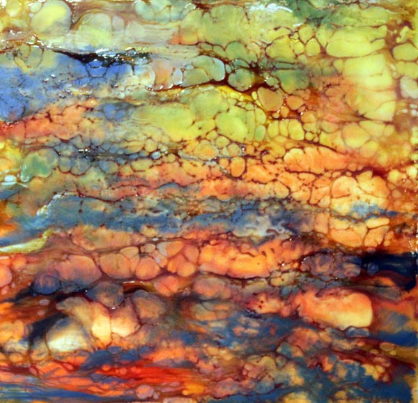
I'd like to say that I'm concentrating on some specific series but I tend to flit from one project to the next depending on what catches my interest at the moment.  I have a very short attention span and get so excited about new projects and techniques that it's really hard for me to create a cohesive body of work.  That sometimes works to my detriment in a marketing sense, but since I paint to make myself happy, I really don't worry about it.  At the moment, I seem to be doing more watercolors (I DO consider myself to be a watercolorist) and acrylics but I am really missing working in encaustics and doing palette knife paintings in oil.  And then there's pastel....and silk painting....and I've been really wanting to try some wood block printing....you can see my problem.  Too many fun mediums, too little time.

2)  How does my work differ from others of its genre?
I tend to paint in a very graphic way.  I'm very black and white in my thinking and have been influenced by my background doing architectural drafting and of making stained glass windows for over 20 years.  I'm definitely a tight painter.  I would love to be able to paint loose, gestural paintings but that's just not me.  Once in a while, I'm able to create one (maybe after a glass of wine?) but most of my paintings are very graphic and tightly rendered.

3)  Why do I create what I do?
I feel very blessed to be able to see the detail and minutia of daily life.  I often miss the obvious, but that's another story.  : )  I usually work from photos I've taken but my favorite art projects are ideas that come from my imagination.  Those are few and far between but definitely become my favorite paintings.  When I work from my photos, I use ones that either bring back a good memory or just that I feel are really beautiful.  I finish a painting each week to post to my blog (a self imposed duty) and a lot of times, picking a subject is the hardest part of the painting.

4) How does my creative process work?
Once I decide on what my subject will be, I chose a medium.  Most of the time, that's the easy part.  I will look at a photo and usually know which medium will show off the subject the best.  Because of my short attention span I tend to jump right into a painting without doing any thumbnail sketches first.  I know my paintings would probably be better if I did the sketch first and did value studies but I prefer to work out the problems in large scale as I paint.  Each painting is a new lesson in mistakes and successes and I like that.
www.nancygoldmanart.com


Now, for the artists that I want to feature:

Leslie Redhead is a watercolorist whose work I've always admired.  She paints directly as well as pouring watercolor and is always sharing her ideas and techniques on her blog and in videos.

Leslie Redhead

Leslie was born in Murray, Ut and was raised in Maryland where she was exposed to all the wonderful art that the museums of Washington, DC had to offer. Her degree is in Zoology because she planned on doing scientific illustration.  However, after a move to Boston and the birth of two children, she began painting and teaching more in watercolor.  Eight years ago, her family moved to Canada which is where Leslie's husband is from.  Leslie's paintings are in private and corporate collections worldwide.  She recently graduated with a Master of Education in Art from the University of Victoria and has signatures with Northwest Watercolor Society (NWWS), Canadian Society of Painters in Water Colour (CSPWC), and the Federation of Canadian Artists (AFCA).  Leslie continues to teach and conducts workshops in Canada, the U.S., and Spain.  Her work is featured in Splash 10:  Passionate Brushstrokes for the Splash: Best of Watercolor series, Leslie Redhead: The Life of an Artist, and Making It!, Case Studies of Successful Canadian Artists.

Leslie currently resides in Vancouver, BC with her husband, two children, and dog.  She is represented by Madrona Gallery in Victoria, BC.
www.leslieredhead.com

Here is Leslie's blog:
http://leslieredheadart.blogspot.com

And some of her youtube videos:
https://www.youtube.com/user/LeslieRedhead


Nan Johnson paints with acrylics, a medium I always find challenging.  I've followed her blog for years and enjoy seeing the diversity in her techniques and painting style.

Nan Johnson

"My artwork focuses on the lines, patterns and shapes that appear in everyday life.  We live our lives surrounded by patterns and shapes that affect our thoughts and ideas - and we may not even be consciously aware of their influence.  Using acrylic paints and painting in styles that combine both oil painting & watercolor techniques, I am able to express the patterns I see in the world surrounding me.  The subject matter of each body of work determines the style or technique that is used to create the final piece.  Each piece invites the viewer to create a story from what they see visually.  Very often, a piece can be interpreted in more than one way - which often leads to the next body of work."

"I hold true to the statement that art is not a thing, it is a way.  A way of expressing, of communicating, and of recording a moment in time where an emotion is felt.  It's all about capturing the visual expression that is found in life.  I find it is a great way to live!"
www.nanjohnsonfineart.com

Here is Nan's blog:
nancies-art.blogspot.com

Belinda Del Pesco is a printmaker and watercolorist whose artwork is both dreamy and emotional.  Her rich colors and soft edges are so beautiful and I wish I could figure out how to achieve that effect!  I've followed her blog for a long time and always look forward to seeing each new post.

Belinda Del Pesco

Belinda is a painter and printmaker in Southern California.  She works in the classical tradition of figure, landscape and still life art, and documents her process in photos on her blog and video on her youtube channel.  A life-long fascination with the nuances of the face and figure, and seasonal changes in the natural light on everyday forms & interiors have been a constant source of inspiration. These ingredients, combined with her affinity for the artistic traditions of the late 19th and early 20th century, create a spirited appetite to paint and print insightful interpretations of what she sees every day.
www.belindadelpesco.com

Here is Belinda's blog:
http://belindadelpesco.blogspot.com

And here is her youtube link:
http://www.youtube.com/bdelpesco

I hope you've enjoyed meeting these artists and learning a little more about me.  Each of these artists will be continuing the 'blog hop' in their own blog posts featuring their favorite artists who blog.


Monday, September 1, 2014

Colorful Cabbage


Colorful Cabbage
Image Size 14" x 21"
Watercolor

This started out as a poured painting.  I poured about 3 layers and then removed the resist and finished it by painting directly because I wanted soft edges within the leaves.  I again used the QoR watercolors because I wanted to see if I needed less paint when mixing my colors for the pours.  I needed A LOT less paint than with the watercolors I've used in the past.  I started with small dabs of fresh paint in my water mixtures and had to add extra water to each color to tone down the intensity.  I was really surprised at how much less paint was necessary.  Usually, I have to keep adding more and more paint to each container to get the level of color I need so I am really happy to have found a paint that is so intense.

By pouring the paint, I got the color blending of the purples in the middle of the cabbage with the greens of the outside leaves.  I think pouring gives the colors in a painting a cohesiveness that you might not otherwise achieve.  It also gives the colors a beautiful glow.

I used a limited palette for the cabbage.  Usually, when I use three primaries there is only one secondary color that is pure and the others are a bit muddy.  I used Alizarin Crimson, Indanthrone blue and Quinacridone yellow.  With these three colors, I was able to mix a beautiful purple and a lot of clear shades of green and although I didn't use orange in this painting, the Alizarin and yellow make a pretty good orange.   I think I've found my favorite triad!

I know that it's supposed to be possible to mix every color from the three primaries but I wanted a warm brown for the background and I didn't feel that I was getting the color I wanted from these three colors so I used a mix of burnt umber and burnt sienna for the background and then brought those colors into the shadows of the cabbage to warm them up a bit.


Monday, August 25, 2014

Koi Reflections

Koi Reflections
Image Size 15" x 22"
Watercolor

Well, I did paint koi on paper this week but it's not abstracted like last week's painting.  My intention was to do another acrylic painting but to use paper instead of canvas.  I decided to use watercolors instead because I just got a new brand of watercolors that I was excited to try.

Golden Artist Colors Inc., known for their acrylic paints, has a new line of watercolor paints called QoR (pronounced 'core').  Their watercolors are made with a different binder called Aquazol instead of gum arabic, which is the commonly used binder in other watercolor paints.  The paints are supposed to have more density of color and dry without dulling like so many watercolors do.  Also, they are supposed to re-wet in the palette more easily.  You can read more about them on Golden's website.

I was very excited when I heard that Golden was making watercolors because I love their acrylic paints. I also like them as a company.  They offer workshops that teach artists all about their acrylics and various mediums and their website has a ton of useful information and videos for artists.  Their virtual color mixer is really fun to use.  You should check it out.

I had high hopes for the watercolors and they haven't let me down.

I enjoyed working with the paints.  The colors I used in this painting were indanthrone blue, quinacridone gold, quinacridone burnt orange, pyrrole orange, cad. yellow (not their brand) and a little bit of cobalt teal.

The colors are definitely intense and I needed less paint to get the strong colors.  You know how I love strong, bright colors!  I'm not sure if they dry less dull than other watercolors or not.  I think I would need to paint identical paintings with the different brands to see if there was a difference.  The paints re-wet very easily in my palette and gave strong color without a lot of brush swishing.

I really like the paints and I am looking forward to using them on a poured painting next.  I think that because the colors are so intense, I'll probably be able to use less paint.  

Monday, August 18, 2014

Koi Klatch

Koi Klatch
Image Size 20" x 30"
Acrylic

I had so much fun painting this painting.  I started by throwing orange and yellow paint on it and then deciding where the koi were.  I wish I had taken a picture of it at that stage.  Then I poured and dribbled and dripped paint in many thin layers to create a sense of depth.

Before I threw the paint on it, I put on a base coat of thinned gesso and moved it around with a small piece of mat board to give it some added texture.  It doesn't show up a lot but in a few places, that texture definitely adds some interest.  This is done on a stretched canvas which isn't what I would usually work on when using very thin acrylics but I do like the texture of the canvas showing through.  I will probably try this again on paper and see how different it looks.

I've always enjoyed painting koi and I think this is my favorite so far.  

Monday, August 11, 2014

Sky High

Sky High
Image Size 6" x 6"
Watercolor
I haven't painted on TerraSkin for awhile so I decided to do this week's painting on that surface.  I was able to paint the background over the entire paper and then lift out the lighter areas and paint the darker areas over the blue.  The ability to lift the color back to the pristine, white paper is definitely a plus with this surface.

Monday, August 4, 2014

Calm Creek


Calm Creek
Image Size 29" x 10"
Watercolor

I've painted this scene before in oil.  This is a watercolor and is much larger.  As I look at this photo, I can see that I need to go back in and add more autumn colors into the leaves of the trees that are leaning into the picture.  I don't take pictures of my paintings until Monday afternoon and that's when I usually see changes that need to be made that I don't see when I look at the actual painting - probably because I'm looking at it too intently and miss the obvious.  Also, lately, I seem to barely be finishing my weekly painting Monday afternoon and I don't have time to make changes before I post it.  Maybe I should be managing my time better.

I did spend the earlier part of the week adding some darks to last week's painting. I am much happier with the it now.  I think it would have had more of a glow if I had used watercolor rather than acrylics though.  Here is the redone version.  If you are getting this post by e-mail and would like to compare it to last week's painting, go to my blog.
I still think I like the one I did a couple of weeks ago in watercolor as a study better than this one.  What do you think?


Monday, July 28, 2014

All Tied Up II

All Tied Up II
Image Size 16" x 36"
Acrylic

Well, I painted the larger version of last week's study but as I see it in this photo, I can see that I need to push the values quite a bit.  So far, I like the study better.  I do like the background texture on this though.  I put a mixture of gesso and water on the paper with a piece of cardboard and made the texture.  I'll probably work on this more this week and see where I can take it.  Do you like the study (the previous post) or this one better?

Monday, July 21, 2014

All Tied Up

All Tied Up
Image Size 19" x 10"
I've finished another unfinished project!  I started this a couple of years ago but worked too slowly and my asparagus didn't survive, so I put the painting aside.  I finished it without a reference.  This is a study for a larger painting so I'm not really concerned about it being really detailed.

I attached rice paper to mat board with a 50/50 mixture of acrylic matte medium and water.  This sealed the paper and makes it a fun painting surface.  The rice paper gives it a nice texture and adds interest.  I think for the larger painting, I will use a gesso mixture and scribe some texture into it.

Monday, July 14, 2014

Farmer's Market Find

Farmer's Market Find
Image Size 6" x 6"
Oil
I found this little cabbage at the farmer's market on Saturday.  It's only about 4" around and if a vegetable can be cute, that is how I would describe this one!  I didn't have time to paint it until today so some of it's fresh glow was gone but it was still a fun subject.  Since it was cloudy today, I couldn't take pictures of it in the sun.  Instead, I set it up in the studio with a light.  My usual light set-up fell and broke this morning so I had to get a new one.  I got an LED light bulb thinking that it would give a realistic daylight color but it seemed much cooler to me.   I think I will change that for the next set-up although the LED lights don't give off as much heat, which was nice.

This is a palette knife painting.  I haven't done a palette knife painting since January and I really missed using that technique so I decided it was time to dig out the oil paints.   Vegetables seem to look really good using the palette knife and I'll probably be doing some more in the near future.

Monday, July 7, 2014

Abstracted Lake Powell

Abstracted Lake Powell
Image Size 29" x 21"
Acrylic
I started painting this with watercolor but it was looking pretty wimpy so I switched to acrylics.  The paper was super wet for the majority of the painting and then I did some final details on dry paper.

Lake Powell is so beautiful with the clear blue skies and rusty colored cliffs and canyons that I just have to paint it every now and then.  I wanted this to have the feeling of Lake Powell without being specific.  


Monday, June 30, 2014

Laguna Coast

Laguna Coast
Image Size 30" x 40"
Acrylic
I know I've painted this scene many times but this one is different.  It's pretty large and it's acrylic.  Acrylic is not the medium that I'm the most comfortable using, especially as thick paint.  I prefer using them as a type of watercolor, very thin and many layers of glazes.  I think my main complaint with acrylics is how fast they dry.  I do use a medium that slows the drying time but it still is frustrating and creates a feeling of tension because I'm trying to beat the clock.  Also, blending is not easy for me to do  with acrylics.

This is painted on a gallery wrapped canvas so there is no need for a frame.  That gives a nice, contemporary look that I really like.

Monday, June 23, 2014

The Sky Above

The Sky Above
Image Size 30" x 22"
Watercolor

I had fun painting this very patterned painting.  I wanted to get the feeling of an underpainting with an image on top.  I've done this before a couple of times with other paintings and really enjoy playing with this idea.  The overlay of white shapes is connected throughout the page to give the feeling of going through a visual maze.

Monday, June 16, 2014

Misty Morning

I've painted this scene before on a smaller scale in watercolor on Aquabord.  This one has been hanging around unfinished for awhile and I decided it was time to finish it.  I'm not sure I am happy with it but I am happy that another project is finished.  I tried to give the feeling of fog but I can see I could have pushed it a little more.  All I can say in my defense is that it looked a lot better while it was wet.  : )


Monday, June 9, 2014

Encaustic Vineyard

I'm still playing with encaustics.  We went to a wedding at a winery in Temecula about a week ago and it was really beautiful there and the wedding was perfect.  This painting isn't of any particular place.  It's more a combination of different wine areas that I've visited.

This is the most detailed encaustic that I've done so far.  It's not like I've done very many - I think I've painted 5 or 6 but I want to continue learning this fun medium.  The sky was especially fun to do on this painting and I think clouds are especially interesting in this medium because the wax gives a sense of movement.

The balloon and wine festival was happening while we were there too and I took a lot of pictures of the hot air balloons so I might try to paint a picture of them in encaustic.  That should be fun.


Monday, June 2, 2014

Waxy Wave

I haven't done many encaustic paintings and haven't tried one for a long time.  I love painting waves and felt like using encaustics for this one.  It was challenging to try to give a sense of movement and get the wax to move in the right direction.  I used a heat gun to fuse each layer which doesn't give a great deal of control  because it heats a much larger area than is sometimes needed.  I had fun with this and would really like to give more time to this medium and build my skills.  I love the look of encaustics and I certainly can't paint too tightly with this medium.  I think I will get a torch so that I can have more control for fusing but that open flame freaks me out.  I do work outside and have an extinguisher handy but I'm such a klutz and if anyone can cause a problem with an open flame, it would be me.

I think my favorite part of completing an encaustic painting is polishing it.  I love the gleam and the look of richness when it is polished.  It looks like a glazed tile.  The only bad thing is that it tends to lose that sheen and needs to be re-polished periodically.  It's no big deal though.  All it takes is a soft cloth or the palm of your hand (with no rings on).

Monday, May 26, 2014

Silk Vineyard

Silk Vineyard
Image Size 13" x 19"
Silk dyes on silk
This is the other silk painting that I took to demonstrate on at the Tustin Art League.  I painted the sky to show them how to work without resist and then blended colors within a leaf and a couple of other places but did most of the painting this past week.  I like the realistic feeling of the sky juxtaposed with the graphic quality of the rest of the painting.  I used black resist on this one to give it the look of a stained glass window.

I haven't steamed this yet and it's not stretched so the border is a little uneven but it will look better when it's steamed and stretched.

Monday, May 19, 2014

Laguna Beach in Silk

Laguna Beach in Silk
Image Size 20" x 20"
Silk dyes on silk
My silk painting demo last week went well.  I really enjoyed it and I hope everyone else did also.  I didn't do much actual painting.  There was so much information to give them so I painted a sky using the watercolor technique (on a different painting) and did some color blending in a couple of other areas.  Mostly, when the resist lines are used on silk, painting the piece is like 'filling in the blanks' and I know anyone new to silk paintings can do that on their own.  I described what to do and how the silk dyes would react but didn't want to waste time having them watch something so simplistic.

I took this painting to work on with the sky and border already painted so that they could see a finished sky and an example of the texture on this border but I worked on another painting that I had done the resist on but not any painting.  You'll probably see it finished in a week or so.

The border texture in this painting was achieved by adding alcohol after the dyes had dried.  The texture in the foliage is a combination of salt being added to wet dye and alcohol being added when the area was dry.    I tried to demonstrate how salt reacts with the dyes but it was so dry here (5% humidity) that the dyes dried before I could add the salt.  Luckily, most of the people watching were watercolorists so they were familiar with using salt.  This painting hasn't been steamed yet and its just pinned to a board.  After it's steamed, the white lines will be more distinct and I can stretch it so that the borders are even.

I've used this image many times but never in silk and since it's one of my favorite spots, I had to use it again.  I think it translates nicely to silk.

Monday, May 12, 2014

Silk Hibiscus

Silk Hibiscus
Image Size 8" x 10"
Silk dyes on silk
I'm going to be the demonstrator for the Tustin Art League on Wednesday and I will be showing how to paint on silk.  I will be showing the serti techique that uses a resist to control where the dyes go as well as the watercolor technique, which uses no resist and creates blurry colors. I also want show an example of how the dyes are controlled when using an all-over resist.  I have an all-over resist that is made by Jacquard called No Flow which I've used in small areas of other silk paintings that I've done but I've never coated the entire piece of silk and tried painting on it.

That is what I did with this painting.  The No Flow keeps the dyes from spreading and they act more like regular paints would on paper or canvas.  It was fun trying this technique but I missed being able to get the dyes to flow together and give that beautiful blended effect that can be achieved using the watercolor technique.

I also tried this same technique using spray starch as the resist.  It didn't seem to resist quite as well as the No Flow - the edges fuzzed a little bit - but it was almost as good.  I tried painting using the starch surface first and had okay results but I felt that there was something missing so I added some broken lines of black resist to create a look of pen and ink along with the color.  Here is that one:

I think I need to add some indications of other flowers and leaves loosely in the background.  I'm not crazy about this composition but I drew it in about 5 minutes so that's why it is as it is.  I learned that salt doesn't have much of an effect on this treated surface which makes sense because the salt can't draw the moisture out of the dyes like it can on an untreated piece of silk.

Overall, these two paintings were a fun experiment and I've added another technique that I can talk about during my demo.  Now, I just need to figure out what I'm going to paint that night.

If you are in the Orange County area and are interested in learning the basics of silk painting, you are welcome to come to the meeting.  It will be held in the board room of the Tustin Unified School District building at 300 south C street, Tustin.  The meeting starts at 7:00.

Monday, May 5, 2014

Early Morning Clouds

Early Morning Clouds
Image size 3.5" x 8"
Pastels
This is a quick pastels study.  I rarely work in pastels but I do enjoy using the medium and I especially like the look of pastels.  I feel like I struggle with the medium which is probably why I don't use it often.  Of course, if I practiced more, I would get better and I would enjoy it more…the old vicious cycle.

Long ago, I put pumice gel on scrap pieces of mat board to have them ready for pastels.  This is a piece of black mat board that has a texture.  I probably should have put the pumice on the back side and painted a surface color instead of using the front for the color and having to deal with this texture.  I like random texture that can be created by the pumice gel but don't like the overall pattern of this texture.  It's hard to get the pastels into the divots and I find that patterned texture annoying.  Oh well,  I tried to deal with it and not let it bother me in this painting.  I like bits of background color peeking through but I think the pattern is distracting.


Monday, April 28, 2014

Irvine Park II

Irvine Park
Image Size 9" x 9"
Oil

I've finished another unfinished project.  Yay!!  I must have started this at least 10 years ago when I tried plein air painting for the first time.  I finished it in my studio making it up as I went since I didn't have a reference.  It was a good exercise and it felt good to finish another project.


Monday, April 21, 2014

A View From The Bluffs

A View From The Bluffs
Image Size 8" x 10"
Oil

This is another view from Heisler Park, which is on the bluffs above the beach in Laguna Beach.  I love these red flowers on the aloe plants that are growing all along the bluffs.  This is one of the most beautiful places I've seen and I'm lucky that I live fairly close to it.  

I painted this on a 8" x 10" canvas which is very different for me.  I usually like to paint on square or long, skinny canvas shapes but this scene seemed like it would look best on this shape.


Monday, April 14, 2014

Loose Landscape

I haven't done silk painting for awhile and wanted to try doing one without resist and playing with hard and soft edges.  I did the sky first wet into wet and allowed it to dry.  Then I did the distant hills and let that area dry.  When you add silk dyes to an area that already has been dyed and dried, a hard line forms.  Sometimes that is a good effect and sometimes it is not.  I was trying for that technique with this project.  I continued to add colors once the previous layer was dry and then I added textures by drying the silk and adding more dyes.  I thought my background hills were going to be lighter than the foreground area when I was dying it but obviously, I miscalculated it.  I should have added the background hills while the sky was wet so that the edges were soft which would make that area recede.

There are things I would do some things differently next time but I think it does look interesting.  I'm really happy with the sky though and I like the juxtaposition of the realistic sky and the stylized ground.

Sunday, April 6, 2014

Golden Plumeria

This is another painting that was started a long time ago.  The background was done but nothing else.  In person, the blue is much prettier.  It is a clear, cool blue, but this is how my camera saw it.  I'm not into painting flowers as much as I used to be, but it feels good to finish another unfinished project.

Hot press paper isn't usually my favorite surface on which to paint but this wasn't too bad.  The paint tends to sit on the surface of the paper rather than settling in so it is really easy to lift but harder to build up glazes without lifting what you don't want lifted.  You can see the unevenness in the background.  It is hard to get a smooth wash on this surface too, but in person, you can see the granulation of the pigment rather than splotchiness, which is actually very interesting.

Monday, March 31, 2014

Cloudy Reflections

Cloudy Reflections
Image size 11" x 7"
Watercolor

This is a small painting that was done mostly wet into wet.  I really wasn't in the mood to paint this week so I decided to just finish this small painting that I had started several months ago.  Clouds are becoming a favorite painting subject for me.  I need to get more reference photos of dramatic skies to paint.  We have mostly sunny, cloudless skies where I live but we are supposed to get rain by tomorrow morning so maybe I'll be able to get some interesting pics soon.

Monday, March 24, 2014

Cactus Apples

Cactus Apples
Image Size 18" x 24"
Watercolor
I really fought with this painting.  I started it as a poured painting just doing one layer and then directly painted the rest of it.  I used Arches 140# paper which is usually really tough and easy to use but I had trouble glazing this without the previous layers lifting.  I'm not sure if that happened because the poured pigments sit on the surface or because the sizing was bad.  This is a piece of paper that I bought recently.  I've heard from many people that Arches has changed their sizing and I haven't talked to any artists that like the new formulation so maybe that was the problem.  This also seemed to buckle much more than my previous paintings on this brand of paper.

Anyway, I like the final look that I got by starting with a poured layer.  Also, I think the analogous color scheme gives this painting a very soothing feeling.
Related Posts with Thumbnails