Monday, November 10, 2014

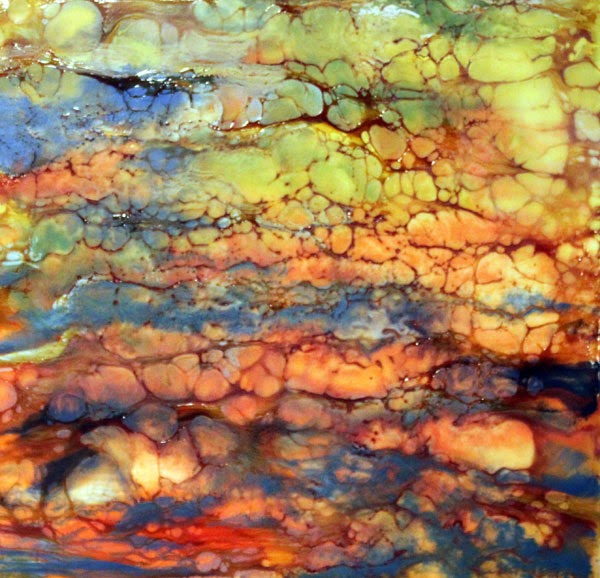
Substratum

Substratum
Image size 8" x 8"
Encaustic

I've been experimenting with encaustics this week.  I really like this medium.  The fluidity of the melted wax is magical.  I love that this medium is not totally controllable.  That's a perfect foil for my black and white personality and controlled painting style.  I'm surprised that painting this way isn't  stressful to me but I'm really enjoying it.  Also, as much as I love to paint in a tightly rendered, representational way, sometimes I want to paint abstractly and this medium is perfect for those times. 

For this painting, I tried doing a shellac burn after I applied and fused the layers of wax.  I love the mottled look that the shellac makes.  I've been wanting to try this for a long time but fire usually freaks me out.  I was working outside (it's best to have good ventilation when working with wax) and put my panel on a piece of stone, but I still had my fire extinguisher next to me when I lit this on fire.  It's actually pretty cool lighting the shellac on fire.  It's hard to see the flame but as soon as the textures make their appearance, it's obvious that it is burning.

So far, I've been using a heat gun to fuse the wax layers.  That is a very acceptable way to work with the wax but I think I would have much more control with fusing small areas if I were to use a torch.  I'm so scared of fire that I haven't wanted to try using one in the past, but now, maybe I'm ready to move ahead and try one. 

I'm such a scaredy cat baby but by having my fire extinguisher at the ready, working outside and having my panel on fire resistant material, using the torch should be pretty safe.  My 83 year old friend has been using a torch for her encaustics for years so if she can do it, so can I, right?

Monday, November 3, 2014

Sun Shade

Sun Shade
Image size 22" x 15"
Watercolor

Last week's painting was painted on a paper parasol from my niece's wedding.  This week's painting is of another niece at that same wedding using one of the parasols.  I guess it would have made more sense chronologically to post this one with the unpainted parasol and then the painted parasol but I didn't think about that until right now.

I haven't painted a portrait for almost two decades and even back then, I think I only painted three or four and they weren't very good. Painting a portrait is very stressful for me and I'm not really very happy with this one.  First, it looks nothing like my niece (she's so much prettier) and it's also very tight.  I was able to start to relax as I painted it by telling myself "it's only a piece of paper" over and over and in the end, I was enjoying the process.  I am looking forward to trying another portrait soon.

Monday, October 27, 2014

Napa


Napa
Image size 31" diameter
Oil

I did finish one of the paintings I mentioned last week.  I started this one a long time ago.  Our niece was married in Napa in September two years ago.  The small wedding was perfect.  It was a beautiful, sunny day, not too hot, and the venue was beautiful.  The grapes were almost ready for harvest and our niece and her groom looked gorgeous in this wonderful setting.  My sister had these paper parasols for all of the guests and I knew that I wanted to paint a vineyard scene on one as soon as I saw them.

I started this painting in acrylic but didn't like the way it looked so I decided to switch to oil.  I painted the sky in oil and then some other project distracted me so this sat unfinished for a very long time.  It feels good to finally finish it.

I tried taking a picture of it with a white background but it didn't work very well so I placed it on the grass instead.  I think the grass gives a nice textural background.    

Monday, October 20, 2014

Pear Study

Pear Study
Image Size 6" x 6"
Oil

I had fun with this palette knife painting.  The colors are much more subdued than my usual paintings.  I almost don't recognize it as one of mine.

It was nice to paint with oils again.  I also worked on a couple of oil paintings this week that have been in the works for a long time (3 years for one, 4 for the other).  I hope to finish one of them for next week.     
The other one is quite large and I plan to continue working on it but it will probably take weeks to finish, even if I stick with it.  At least my motivation to paint both of them has returned.

Monday, October 13, 2014

Mexico Sunset

Mexico Sunset
Image Size 11" x 30"
Watercolor


Finally!  A post where I won't be complaining about watercolor paper!  I'm sure you were getting tired of hearing me moan about such a silly thing as paper.  For this painting, I used Waterford 200# cold press paper and painting on it was easy and predictable.

I haven't worked on this paper for awhile but I've always liked it.  It doesn't buckle like 150# paper does and it doesn't hold onto water so long which causes the paints to blend too much as can happen on 300# paper.

It was fun to play with the soft edges for these clouds.  The reference photo that I used has a boat in it and I will probably paint another version in the future and include that.

Monday, October 6, 2014

Long Shadow

Long Shadow
Image Size 7.5" x 9"
Watercolor

I'm still having paper issues.  This painting is done on Fabriano Artistico and I don't think it will be my "go to" paper.  I like to paint by glazing multiple layers of color and on this paper, when I added layers, the previous layers lifted.  I think that is because there is a lot of surface sizing but I'm not sure.  I know, I sound like Goldilocks...too little sizing, too much sizing....  Also, it is a very fragile paper and I had some problems with it pilling while I was lifting paint.  I think it is a really nice paper for a lot of artists, but it didn't hold up to the way I paint.


Monday, September 29, 2014

Jellyfish


Jellyfish
Image size 30" x 22"
Watercolor

I took the reference photos for this painting from our trip to the Vancouver aquarium four years ago and have always loved the brilliance of the oranges and blues and finally decided to try to paint them.  I'm not sure that I captured the lighting that made them glow but I'll live with it for awhile and then decide if I need to make any changes.

I used Lanaquarelle paper, and in the past, I remember it being easy to lift paint from but I didn't find that to be the case here.  In fact, in the upper left corner, I think the sizing had disintegrated already even though I had just opened the pack of paper so I wasn't able to lift paint at all.  There are 10 sheets in the pack so I'm not too happy about the possibility of so many pieces of paper having sizing issues.

I'm getting really tired of holding my breath every time I put paint to paper waiting to see if there is sizing in the paper or not.  I have heard that Arches paper company changed its sizing in the past couple of years and many artists don't like it ( my Arches paper is older than that) but I'm wondering if all of these paper companies have changed to a sizing that has a short shelf life.

In the case of the Arches paper, I heard that there were environmental issues with the old sizing and that was the reason for the change.  I've been told that sizing is a plant based ingredient, so I'm not sure why there were environmental issues.  I just know that I'm getting really tired of not having confidence in any of my watercolor paper.  

Monday, September 22, 2014

Spiky Succulent

Spiky Succulent
Image size 15" x 22"
Watercolor

I really fought with this painting!  I planned for it to be a poured painting but as soon as I got the paper wet, I knew I was going to have problems.  Even though I haven't had this paper very long (maybe 18 months) the sizing was gone so it acted like a blotter paper.  Of course, I have no way of knowing how long the paper was in the art supply store before I purchased it.  

I did do a couple of pours but because there was no sizing, the paint just soaked in and didn't move so I got streaks instead of flowing color.  I had spent so much time drawing this that I didn't want to throw it away so I began to paint it with a brush.

When there is no sizing, it's impossible (for me anyway) to build strong darks because the paints continue to soak into the paper and disappear so I decided to paint a layer of matte medium over the whole painting to seal it and then continued painting.  Of course, once the paper is sealed it is no longer absorbent so the paint sits on the surface and when you try to add darker layers, it tends to lift your previous layers.  I had to use a really light touch and dab rather than brush on the paint.

I used the QoR paints again and started with that same triad - quinacridone gold, indanthrone blue and alizarin crimson.  One interesting thing about the paper not having any sizing is that the paints meld together and sink into the paper and become so soft looking that it almost looks like the painting is on suede.  After I sealed the paper, I decided that the colors were almost too soft and neutral because they had all blended together, so I added a mixture of thalo blue (green shade) and green gold to bring some brightness to the painting.  I'm really happy with the way the colors look and it was nice to use these paints in a way that shows off their subtle colors since the other paintings that I've done with them have been pretty bright.

In the future, I don't think I would choose to paint on paper without sizing (like printmaking paper) but I do have a lot of watercolor paper that I've had for years and since sizing seems to degrade over time,  I will probably be in this situation again.

Even though it is a challenge to paint on paper with no sizing, I think that forcing myself to make it work was a very good exercise.  

I'm really happy with how this painting turned out so I'm glad I stuck with it and didn't let the paper win!  This painting is one of my favorites so far which is saying a lot since I've painted well over 300 paintings in the past six years.

Monday, September 15, 2014

QoR Watercolors on TerraSkin

Cactus Flower on TerraSkin
Image Size 6" x 7.5"
Watercolor

I haven't painted with watercolor on TerraSkin for awhile and I thought that it would be a good surface to try with the QoR watercolors.  I love how bright these colors are!  Paints always look brighter on TerraSkin than on regular watercolor paper because the surface is nonabsorbent and the  colors sit on the surface but these seem even brighter, which I love.  Bright colors make me soooo happy!

I used a bit of artistic license with the colors of the flower.  It was really only pink but I threw in some purple and orange to get a more luminous look.  Most of the texture in the background was achieved by spritzing it with some water while it was wet and some was added with brushwork.

Monday, September 8, 2014

Calm Sea

Calm Sea
Image Size 24" x 8"
Acrylic

I didn't have a lot of time to paint this week so I did this simple painting.  I did a base coat of a dark blue (top) turquoise, (middle) and ochre (bottom) and after that dried, I coated the canvas with gesso in a random pattern which created that great texture in the painting.  Then I finished the painting with a combination of pouring and painting.
Related Posts with Thumbnails