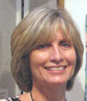
I found Deborah's blog shortly after I started painting on silk. Her silk paintings are beautiful and I love how she is always experimenting with new techniques.
Deborah Younglao
 "Painting on Lustrous silk with brilliant, liquid dyes has been my passion for nearly 20 years. A piece of silk being painted becomes a living thing. While the dyes are wet they are constantly on the move...the creation in front of me is always changing. The dyes, the silk and I dance together. Sometimes I lead; more often than not the painting leads. My painted silk may become a 2-dimensional painting, a 3-dimensional quilt, or a fluid piece of wearable art to grace your shoulders."
www.deborahyounglao.com
Here is Deborah's blog:
www.deborahyounglao.com/blog
Okay, here are the questions I need to answer about my own work:
1) What am I working on?
I'd like to say that I'm concentrating on some specific series but I tend to flit from one project to the next depending on what catches my interest at the moment. I have a very short attention span and get so excited about new projects and techniques that it's really hard for me to create a cohesive body of work. That sometimes works to my detriment in a marketing sense, but since I paint to make myself happy, I really don't worry about it. At the moment, I seem to be doing more watercolors (I DO consider myself to be a watercolorist) and acrylics but I am really missing working in encaustics and doing palette knife paintings in oil. And then there's pastel....and silk painting....and I've been really wanting to try some wood block printing....you can see my problem. Too many fun mediums, too little time.
2) How does my work differ from others of its genre?
I tend to paint in a very graphic way. I'm very black and white in my thinking and have been influenced by my background doing architectural drafting and of making stained glass windows for over 20 years. I'm definitely a tight painter. I would love to be able to paint loose, gestural paintings but that's just not me. Once in a while, I'm able to create one (maybe after a glass of wine?) but most of my paintings are very graphic and tightly rendered.
3) Why do I create what I do?
I feel very blessed to be able to see the detail and minutia of daily life. I often miss the obvious, but that's another story. : ) I usually work from photos I've taken but my favorite art projects are ideas that come from my imagination. Those are few and far between but definitely become my favorite paintings. When I work from my photos, I use ones that either bring back a good memory or just that I feel are really beautiful. I finish a painting each week to post to my blog (a self imposed duty) and a lot of times, picking a subject is the hardest part of the painting.
4) How does my creative process work?
Once I decide on what my subject will be, I chose a medium. Most of the time, that's the easy part. I will look at a photo and usually know which medium will show off the subject the best. Because of my short attention span I tend to jump right into a painting without doing any thumbnail sketches first. I know my paintings would probably be better if I did the sketch first and did value studies but I prefer to work out the problems in large scale as I paint. Each painting is a new lesson in mistakes and successes and I like that.
www.nancygoldmanart.com


Now, for the artists that I want to feature:
Leslie Redhead is a watercolorist whose work I've always admired. She paints directly as well as pouring watercolor and is always sharing her ideas and techniques on her blog and in videos.
Leslie Redhead
 Leslie was born in Murray, Ut and was raised in Maryland where she was exposed to all the wonderful art that the museums of Washington, DC had to offer. Her degree is in Zoology because she planned on doing scientific illustration. However, after a move to Boston and the birth of two children, she began painting and teaching more in watercolor. Eight years ago, her family moved to Canada which is where Leslie's husband is from. Leslie's paintings are in private and corporate collections worldwide. She recently graduated with a Master of Education in Art from the University of Victoria and has signatures with Northwest Watercolor Society (NWWS), Canadian Society of Painters in Water Colour (CSPWC), and the Federation of Canadian Artists (AFCA). Leslie continues to teach and conducts workshops in Canada, the U.S., and Spain. Her work is featured in Splash 10: Passionate Brushstrokes for the Splash: Best of Watercolor series, Leslie Redhead: The Life of an Artist, and Making It!, Case Studies of Successful Canadian Artists.
Leslie currently resides in Vancouver, BC with her husband, two children, and dog. She is represented by Madrona Gallery in Victoria, BC.
www.leslieredhead.com
Here is Leslie's blog:
http://leslieredheadart.blogspot.com
And some of her youtube videos:
https://www.youtube.com/user/LeslieRedhead
Nan Johnson paints with acrylics, a medium I always find challenging. I've followed her blog for years and enjoy seeing the diversity in her techniques and painting style.
Nan Johnson
 "My artwork focuses on the lines, patterns and shapes that appear in everyday life. We live our lives surrounded by patterns and shapes that affect our thoughts and ideas - and we may not even be consciously aware of their influence. Using acrylic paints and painting in styles that combine both oil painting & watercolor techniques, I am able to express the patterns I see in the world surrounding me. The subject matter of each body of work determines the style or technique that is used to create the final piece. Each piece invites the viewer to create a story from what they see visually. Very often, a piece can be interpreted in more than one way - which often leads to the next body of work."
"I hold true to the statement that art is not a thing, it is a way. A way of expressing, of communicating, and of recording a moment in time where an emotion is felt. It's all about capturing the visual expression that is found in life. I find it is a great way to live!"
www.nanjohnsonfineart.com
Here is Nan's blog:
nancies-art.blogspot.com
Belinda Del Pesco is a printmaker and watercolorist whose artwork is both dreamy and emotional. Her rich colors and soft edges are so beautiful and I wish I could figure out how to achieve that effect! I've followed her blog for a long time and always look forward to seeing each new post.
Belinda Del Pesco
 Belinda is a painter and printmaker in Southern California. She works in the classical tradition of figure, landscape and still life art, and documents her process in photos on her blog and video on her youtube channel. A life-long fascination with the nuances of the face and figure, and seasonal changes in the natural light on everyday forms & interiors have been a constant source of inspiration. These ingredients, combined with her affinity for the artistic traditions of the late 19th and early 20th century, create a spirited appetite to paint and print insightful interpretations of what she sees every day.
www.belindadelpesco.com
Here is Belinda's blog:
http://belindadelpesco.blogspot.com
And here is her youtube link:
http://www.youtube.com/bdelpesco
I hope you've enjoyed meeting these artists and learning a little more about me. Each of these artists will be continuing the 'blog hop' in their own blog posts featuring their favorite artists who blog.