Monday, August 8, 2016

Green Onions

"Green Onions"
Image size 6" x 6"
Oil

I can't believe that it's been a year and a half since I've painted in oil and two years since I've done a palette knife painting.  Even though oil isn't my favorite medium, I do like painting with a palette knife so it surprises me that I've let so much time pass without using that tool.  

I went to the Farmer's Market this weekend hoping to find some incredible vegetables to paint but there was nothing that screamed "PAINT ME" so I ended up with these little onions.  I chose a red background to add some punch.  I do love red but rarely use it.  I wonder what's up with that?  I'll have to concentrate when I make my color choices for future paintings instead of always going with my comfortable colors.

Monday, August 1, 2016

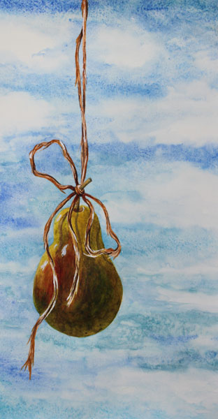
New Heights

"New Heights"
Image size 15" x 8"
Watercolor and Acrylic

This is painted on a piece of 140# hot press Arches paper.  As soon as I began wetting the paper, I could see that it had problems with the sizing.  That seems to be an ongoing problem with the paper that I have.  I have purchased some new Arches paper for projects that involved a lot of drawing where I don't want any surprises with how the paper will react, but I've come to expect most of the paper that I have stored will have problems with the sizing so I'm keeping a lot of matte medium on hand so I can seal the paper when I have this problem.

I'm sure that I've had this paper for at least 10 years because I don't typically buy hot press paper.  I find it hard to work on since I like to paint with many glazing layers.  The previous layers tend to lift on hot press, which is really frustrating.

Of course, when I seal the paper with matte medium, the paint layers lift even easier.  In this painting, I painted the background and initial base colors of the pear with watercolor.  Since I wasn't doing additional layers on the sky, the watercolor was fine.  For the pear, the watercolor was lifting way too much so I carefully painted a layer of matte medium over the watercolor and painted the rest of the layers in acrylic.  There's always a way to make things work, which is a fun challenge.


Monday, July 25, 2016

Waterways

"Waterways"
Image size 16" x 8.5"
Acrylic
This looks like an underwater infrastructure to me.  Painting watery looking paintings seems to ease the heat we are having.  I painted this on TerraSkin, which I haven't used for quite a while.  If you regularly follow this blog, you might remember that TerraSkin is a surface made from stone dust and non-toxic resin.  It is mostly non-porous, but the surface has a little bit of tooth which holds the paint a bit better than Yupo, another non-porous 'paper'.

I love using fluid acrylics on this surface.  I've also experimented with watercolor, oil and pastel, but I think acrylics are so perfect to used in transparent layers.

Monday, July 18, 2016

New Zealand Sky

"New Zealand Sky"
Image Size 11" x 15"
Watercolor

I've been busy working on my house this past week so I didn't have much time for painting.  Here is a watercolor skyscape.  I really enjoy painting skies in watercolor and you'll probably be seeing a lot more in the future.

Monday, July 11, 2016

Oceans Apart

"Oceans Apart"
Image Size 21" Diameter
Watercolor

This is a circular painting on a handmade piece of watercolor paper.  I bought a few of these papers several years ago.  I love the shape of the paper and the fact that it has a deckle edge.  These look wonderful when framed with the paper floated so that the edges show.  This paper doesn't have any sizing in it but I painted on it while it was saturated which seemed to work well.  I used some heavy sedimenting paints - Daniel Smith's Lunar Earth, Lunar Black and Lunar Blue and was hoping for some heavy textures but the effects are pretty subtle.  That could be because of the lack of sizing but I'm not sure.
I kept layering colors and created the design in the lower two thirds with a combination of cobalt turquoise, Titanium White, Lunar Earth and Ultramarine Blue while the paper was in varying degrees of wetness.

If you're not familiar with the "Lunar" colors from Daniel Smith, they have very heavy particles in the paints that settle into the texture of watercolor paper.  Any other colors you mix them with take on those characteristics and sometimes separate from the heavier particles which gives a beautiful effect.  Lunar Earth is my favorite of the Lunar colors.

Monday, July 4, 2016

Breaking Wave

"Breaking Wave"
Image Size 15" x 22"
Watercolor

I'm embracing one of the symbols of summer this week.  I really enjoy painting crashing waves and trying to capture the feeling of power in the water.  It's fun to paint in any medium but painting it in watercolor is always a challenge because the whites have to be saved when working with only transparent watercolor.  I used resist to save many of the whites and then worked wet into wet to get the softness of the spray and color blending in the wave.  I like the graphic quality that the hard edges of the resist add to the painting.

Monday, June 27, 2016

Pepper Trio

"Pepper Trio"
Image Size 14" x 14"
Watercolor

The majority of this painting was done on saturated paper.  I'm really happy with the colors and softness of the background.  I used a blend of green, blue and purple in the background to bring out the complementary colors of the peppers but in this photo only the green really shows.  I probably could have painted the blue and purple a bit bolder, but didn't want to take away from the shadows by having the background darker.

Monday, June 20, 2016

The Red Hat #2

"The Red Hat #2"
Image Size 11" x 11"
Watercolor
This is my second attempt to paint my friend Beverly.  I still don't feel like I've captured her essence and I know the reason for that is that both paintings I've done show her not smiling.  I'm surprise I even have any photos of her not smiling because she's always smiling.

I will try it one more time using a reference photo with her smiling.  I have several good ones but have hesitated to try painting her smiling because I don't want to deal with painting teeth.  It's probably not a big deal, but that's one more thing that I've always found intimidating.

Monday, June 13, 2016

Cerulean Sky

"Cerulean Sky"
Image size 7" x 11"
Watercolor
I haven't painted a skyscape for a while so that was this week's project.  I love the colors in the sky, going from ultramarine at the top into cerulean at the horizon.  I remember the first time I saw a distinct color change like this in the sky was when I was visiting Lake Powell.  The colors always seemed to be more intense there than in So Cal - probably because of the cleaner air.  It was as though those two colors had been used directly out of the tubes to color the sky that day.

So, that is what I did in this painting.  The sky is the focal point of this piece and the sand dune/water is less important to me.

I painted the sky on saturated paper and after it dried I added the land and water.

Monday, June 6, 2016

Guacamole II

"Guacamole II"
Image size 11" x 18"
Watercolor
This probably looks very familiar to you because I've painted it before.  I wasn't happy with how all of the values were in the middle range so I painted a second one with a very dramatic background.  I masked the subjects so that I could get a very smooth background and used colors that lift so that I could soften the edges after I removed the masking.  Unfortunately, since they were liftable colors and I didn't get the darkness that I wanted with my initial wash, when I added more washes, the color lifted.  I don't usually use an airbrush, but for this project, it worked perfectly to achieve the darkness and the variegated background.  After removing the masking, I wasn't able to soften the edges anyway so I'm not sure what was happening - suddenly, the liftable colors weren't lifting.

I really like my idea for this painting but I can't really say that I'm thrilled with either version.  I like the value contrast of this one but I should have used a different background color.  This is too much green, even for me.

Here is a picture of the first painting:
 I would love to hear your honest opinions of these two paintings.  

Related Posts with Thumbnails